
The builder brings the field palette, field settings and form canvas into one workspace. Open a form from Logical Forms → Forms to start editing its saved configuration.
Understand the workspace
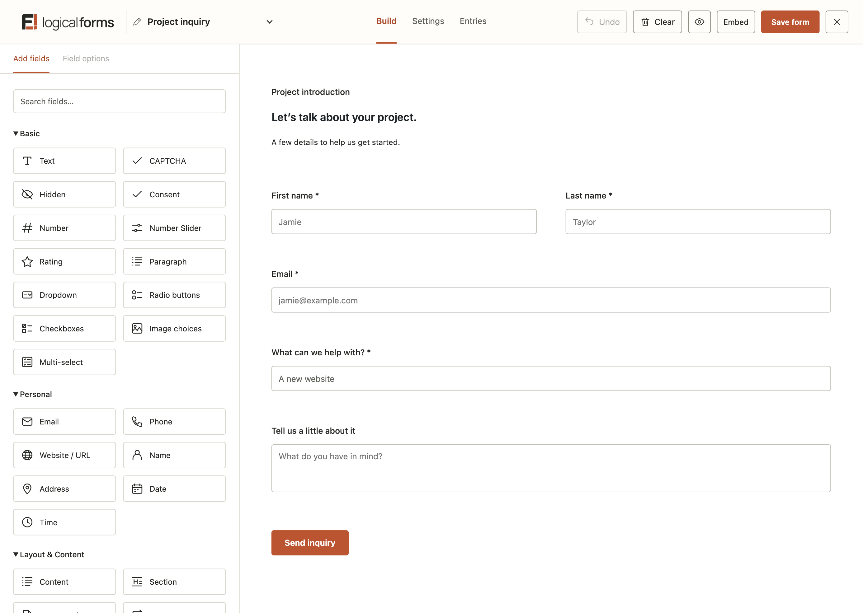
The header shows the form name and provides Build, Settings and Entries navigation. Use the name field to rename the form, the adjacent switcher to choose another saved form, and the logo to return to the Forms list.
The left sidebar has Add fields and Field options tabs. The main canvas shows the questions and their layout. The submit button sits after the field layout and has its own options.
Add fields and edit their options
- Open Add fields. Expand a group such as Basic or Personal, or use Search fields.
- Select a field button to add a new field at the bottom, or drag it to an available insertion position.
- Select a field on the canvas to open Field options.
- Edit the available General, Appearance and Advanced controls. The controls depend on the field type.
Changes such as labels, descriptions and placeholders update the canvas as you work. The canvas is an editing surface: example values and controls are not a visitor submission. Use the saved Preview and an embedded page to inspect the finished form.
Arrange rows and widths
Drag a field to change its position or place it beside another field. The layout uses twelve columns, with up to four fields in a normal row. Each normal field spans at least three columns. Some layout elements require a full row.
Drag the resize handle on a field edge to adjust its width. Where the edge is shared with the next field, resizing changes that pair's boundary. A final field can use spare space left in its row. On small screens, public form fields stack to keep them usable.
Keyboard users can focus a field and use Enter or Space to open its options, or Alt plus arrow keys to move it. A focused resize handle accepts arrow keys, with Home and End moving to its available limits.
Duplicate, remove and undo
The field's duplicate control creates an independent copy with a new field ID. The remove control deletes that field from the current layout. Copies retain their own settings; editing one does not update the other.
Undo reverses recent builder document changes, including field options and layout edits. It does not undo editing the form name. Clear removes the current fields while keeping form-level settings; use it deliberately and inspect the result before saving.
Configure the submit button
Select the submit button on the canvas to open its settings. You can change the ordinary label, the processing label shown while sending, width and alignment, and an optional CSS class. Auto width follows the label; Full width fills the available form width.
Use a label that describes the action, such as Send enquiry. This label does not decide where the visitor goes or which emails are sent; configure those separately under Confirmations and Notifications.
Save, preview and embed
Select Save form to persist the builder changes. The eye-shaped Preview link opens the saved version, so save first when you want to inspect new edits. Submitting this saved Preview creates a real entry and runs configured actions, including emails and add-on feeds. Review those actions before testing. The separate Appearance preview is read-only.
Use Embed to choose a page or copy the shortcode. Publishing the form's changes and updating a WordPress page are separate actions. Follow the embedding guide, then test a real page submission.